

Original · text+ own work · public
Illustrations
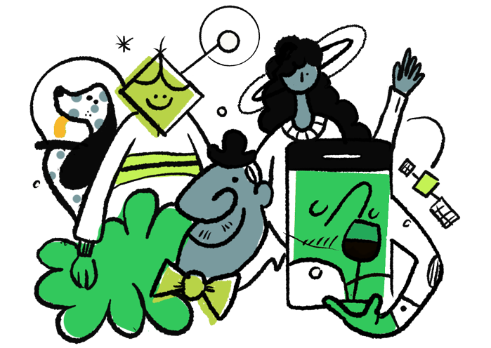
Our illustrations are hand-drawn and made in-house: our own work, not a stock or licensed set. They’re the warm, human side of the brand: they set tone and carry emotion where a functional icon would be too cold. Unlike the icon set (which is licensed and team-internal), these are ours to use and to show freely.
Each of these ships a light and a dark version: the cards swap automatically with the theme (try the toggle, top right).

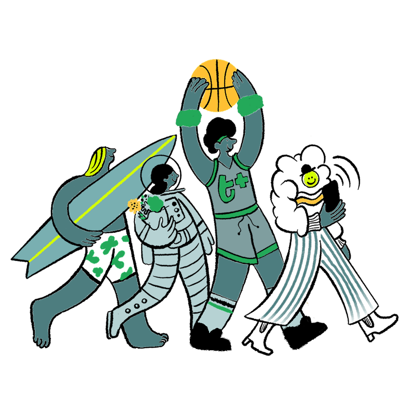
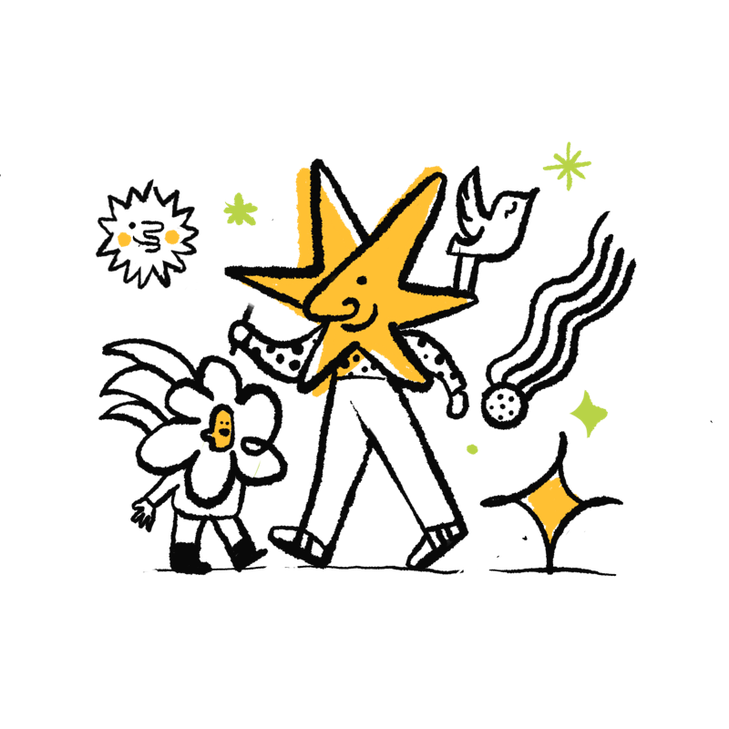
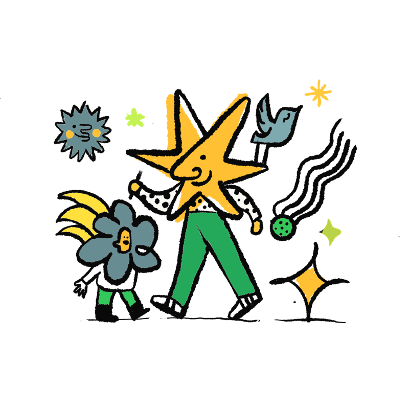


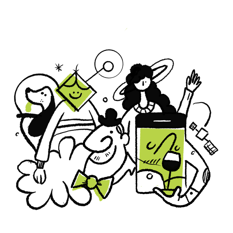
Use when
Section titled “Use when”Use when
- Setting the tone at a moment. Onboarding, welcome, a feature highlight.
- Warming up an empty state or a promotional surface.
- Carrying emotion the copy alone can’t.
Don’t use when
- You need a functional signal. That’s a signage icon, not an illustration.
- Inside a button, nav item or list row. Illustrations are never the tap target.
- More than one per screen. They lose impact and crowd the message.
Hand-drawn line with warm accents. The brand green and yellow over the cream ground, the same palette as the rest of the system. Loose, human, a little playful; never corporate clip-art. They’re the visual half of the brand’s cercano · simple · cálido personality (the verbal half lives in Voice & tone).
- Render large: 96-160px+; they’re expressive, not UI-scale.
- Colour freely from the brand palette; they’re decorative, so the 3:1 icon-contrast rule doesn’t apply.
- Keep the hand-drawn line consistent; don’t mix in a different illustration style.
Dark mode
Section titled “Dark mode”Illustrations are drawn light-first. They don’t invert. Dark-line art on a light ground breaks on a dark surface, so each one needs a hand-made dark homologue (redrawn on dark), never an auto-tint. The gallery above already swaps to it per theme.
- Have a dark version (swap automatically):
welcome·premium·banana·bright-future, plus the onboarding error states (bike·skateboard·not-found). - No dark version yet: e.g.
no-ads·gum. Until one exists, keep them on a fixed light card so they always read. Never straight on a dark background:
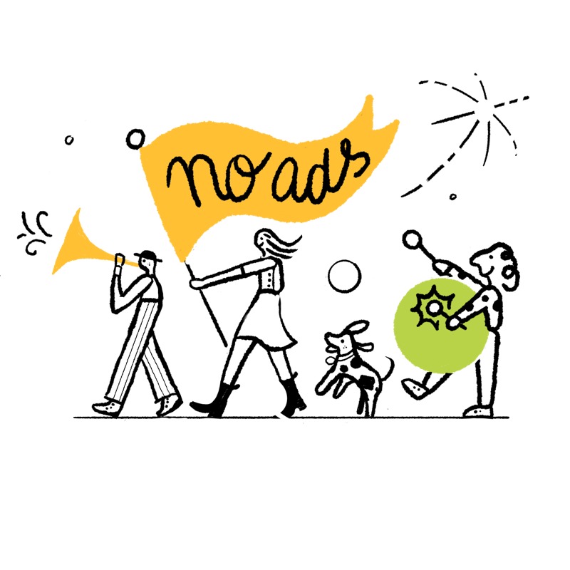
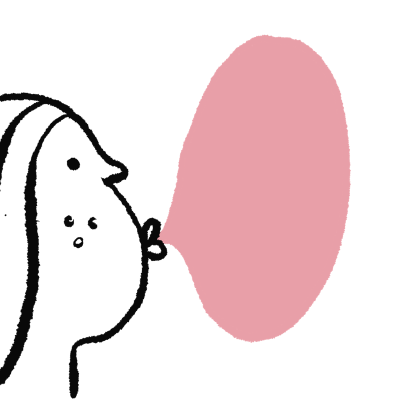
- Never auto-tint or invert an illustration to fake a dark version. Draw the homologue.