

WIP · v0.2
Surfaces & controls
The surface is the target. The button is the commit. Most of the time a person taps a whole card or a whole row, and a button is reserved for the moment something actually happens. Getting that split right removes more buttons from a screen than any other rule we have.
Rules carry their governance state. Closed is settled in an ADR or the Decision Log. Approved was agreed in August 2026 and is pending registration. Derived comes from reading the new-design screens and has not been ratified yet.
A screen has three levels, not five
Section titled “A screen has three levels, not five”Before any rule about buttons, this is the thing to internalise. Every screen we ship is built from
three levels, and depth is always fill, never brand colour. The swatches below are the Light
values: in Navy levels 2 and 3 resolve to the same Teal/800, so the ladder reads with two rungs,
not three.
1 · The groundscheme/background, cream. What everything else floats on. It can carry a loose element, a button or an icon that belongs to no block, but it is not the canvas: content lives on a surface.
2 · The surfacescheme/surface, white. The card, and the main canvas of the app. This is where content is grouped and where controls normally live.
3 · The tonal rowscheme/surfaceContainer. Only ever inside a surface, to group repeated items under a header. It is not a card and it never floats on the ground.
Emphasis is white elevated, then white flat, then tonal. A card is never made important by making it green. Derived
Read it off a real screen
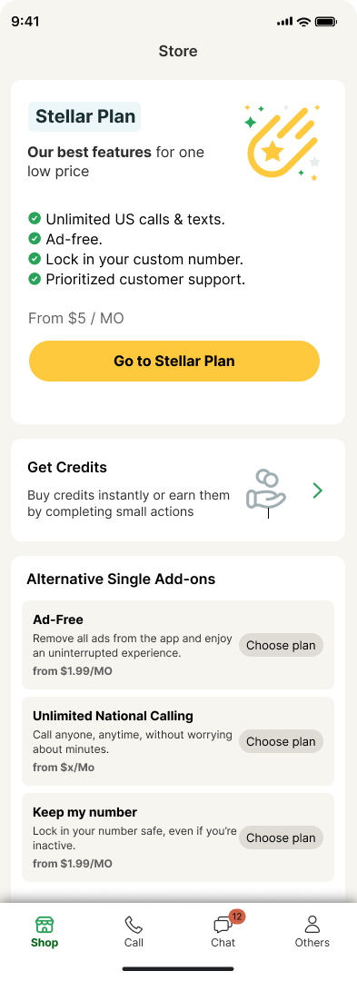
Section titled “Read it off a real screen”This is the Store, exactly as it is built. Every rule on this page is visible in it.
 123456
Store, root screen. Exported from the Playground, not redrawn.
- 1
Hero cardThe one promoted offer, at the top, max one per screen. White on cream, so it reads as lifted rather than coloured.
- 2
The exception: a Primary inside a cardThe only card allowed to hold the screen CTA. Note what does not happen: the card body is not tappable. The button is the target, and it is alone in owning that job.
- 3
Action Card, navigatingTitle, description, illustration, trailing chevron. No button anywhere, because tapping it goes somewhere rather than doing something.
- 4
A section, not a card of cardsOne white surface holds the header and the rows. The rows do not each become their own card floating on cream.
- 5
Option rows, tonalRepeated alternatives inside that surface. Price bottom-left and muted, action right-aligned. Three of these cannot be three primaries, so each takes the lowest rung that still executes.
- 6
ChromeFour destinations, equal widths, labels always visible. Active is green icon and label. Pills never live in chrome: it holds icons only, and those icons sit on the bar itself rather than on a card.
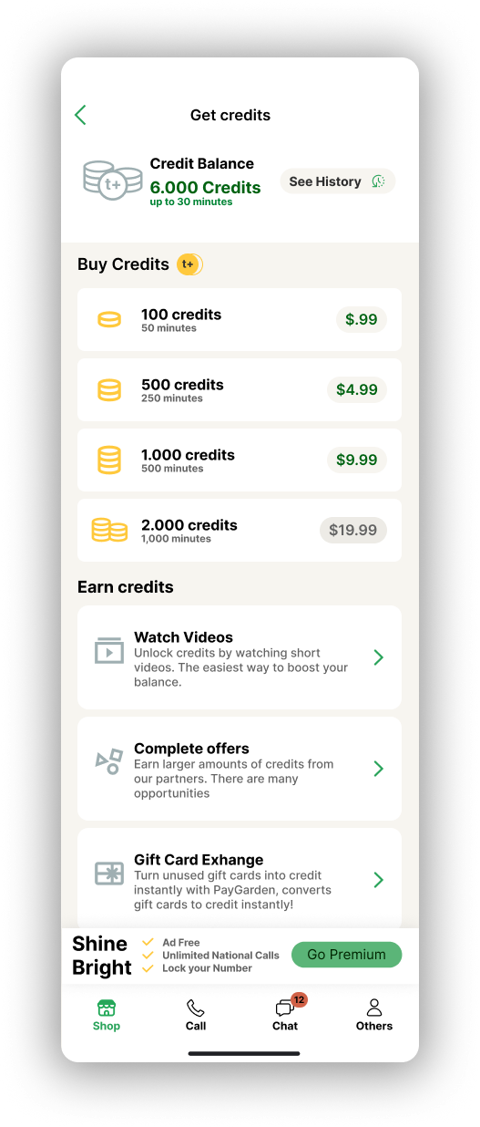
Now the same rules under load, on a denser screen:
 1234
1234Get credits, a detail screen reached from pin 3 above.
- 1
Detail, not rootBack chevron top-left, centered title, no bottom nav in the flow. One flow, one exit. Back is always this chevron, never a text link.
- 2
A surface that is not tappableThe balance panel is a white surface carrying information. Being a card does not make something a target: only a chevron, a control or a button says that.
- 3
Why whole-surface targeting pays offThe price sits in a tinted pill that reads as tappable. It is not a button, and it does not matter: the whole row is the target, so wherever the finger lands the same thing happens. That is the point of the rule. The ambiguity would only hurt if the pill were the target and the rest of the row were dead.
- 4
Chevron again, same meaningThree navigating cards in a row. Same signal as pin 3 on the Store, because the system only has one arrow and it always means “this goes somewhere”.
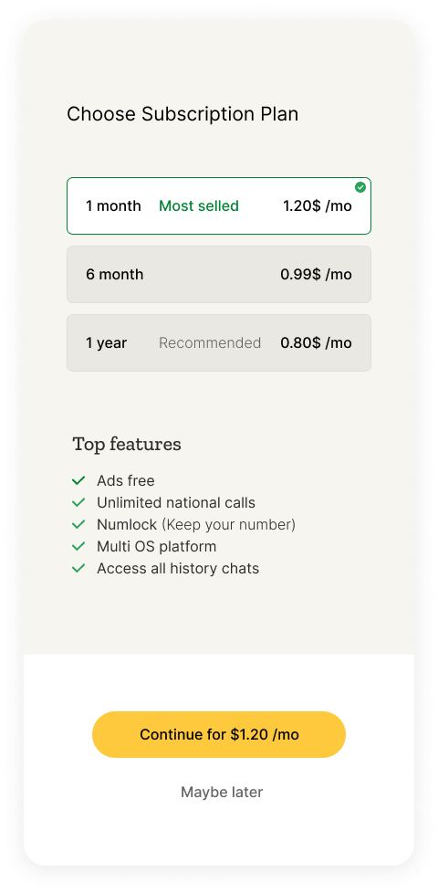
And a third, where the rule becomes unavoidable:
 12345
12345Choose Subscription Plan. Select above, commit below.
- 1
Selected is fill plus border plus checkThree signals, not one. The chosen plan turns white and gains a green border; the others stay tonal. Colour alone would fail, and here it never has to carry the state by itself.
- 2
Choosing is not committingNothing on these three cards executes anything. They are a card-radio: mutually exclusive, and completely inert until the CTA at the bottom is pressed.
- 3
Content on the groundThe feature list sits directly on the cream with no card under it. The surface is the canvas for grouped content and for controls, not a container everything has to be wrapped in.
- 4
The action zone is its own surfaceA white band pinned to the bottom, holding the one Primary that closes the screen. It is the only place the screen CTA lives.
- 5
The escape never competes”Maybe later” is a text link centered under the CTA. Two actions stack, they never sit side by side as two solid pills.
One coloured button per screen, and it is always yellow. Since August 2026 there is no green button to compete with it, so the only question left is whether this screen has earned its one. If a second action has to be there, it drops to Secondary or to Tertiary. Two coloured pills on one screen is the rule the legacy app broke most often, and it is what made green stop meaning anything.
Does this action need a button?
Section titled “Does this action need a button?”Four questions, in order. The first one that matches wins.
Q1 · Does it navigate? No button. The whole surface is the target, with a trailing chevron. List Row in lists, Action Card when it is featured. Closed
Q2 · Does it select? No button. A card-radio or a trailing control. The commit happens later, in the action zone. Closed
Q3 · Does it execute? Button. If it closes the screen it is a Primary Full in the action zone, one per screen. If it executes on a surface, it has to be one of the three exceptions below.
Q4 · Is it an escape? Text link. Inline in helper copy, or centered under the CTA. Never inside a surface that is already tappable. Derived
None of the four applied? Then it is probably not an action, it is content. Do not make it tappable.
How a surface says it is tappable
Section titled “How a surface says it is tappable”A closed list. A signal that is not here goes through the Variance Gate (D-010) or it does not ship.
- A trailing chevron means “this navigates”. The only arrow in the system, always trailing, never a “See more” text link. Closed
- Fill and elevation invite the tap, in that order: white elevated, white flat, tonal. Brand colour never signals importance. Derived
- A green border and a checkmark mean “this is selected”. Closed
- The ripple covers the whole surface. A partial ripple betrays a partial target. Approved
- A visible trailing control (radio, switch) declares the row’s action type. Closed enum. Closed
Three anti-signals, all forbidden: a tappable word inside a tappable surface, a chevron and a button in the same card, and dead zones inside a surface that reads as a whole.
The three exceptions
Section titled “The three exceptions”A button may sit inside a surface only when the action is transactional. It is a commit, not navigation and not selection, and the button marks the point of no return.
| exception | what it takes | why |
|---|---|---|
| Hero card | Primary Hug | it owns the screen CTA, so the body is not tappable |
| Option row | Tertiary Small | N rows cannot be N primaries, and they contract rather than navigate |
| Action Card | trailing button, only if inline | chevron if it navigates, button if it executes. Never both |
Everything else is an anti-pattern. It enters through the Variance Gate or it does not enter.
Where controls are allowed to sit
Section titled “Where controls are allowed to sit”The white surface is the canvas. Controls that belong to a block of content live on it, and that is the default you should reach for. Look at both screens: everything that groups content is a card, and the controls sit inside those cards.
But this is a default, not a closed rule. A loose element that belongs to no block, a single button or a bare icon, can sit on the ground. What you need to know is the trade you make when it does.
On cream the green fill drops to 2.97:1 against what is behind it, where on white it holds 3.24:1. The button does not stop being accessible, since a labelled button is identified by its label, not its edge. What it loses is its outline: it stops reading as a defined shape and starts blending into the page.
So: on a surface by default. On the ground when the element genuinely stands alone, knowing it will read softer, and never for a control that is part of a group.
Radius: cards radius/xl (16), bottom sheets radius/2xl (24) on the top corners only.
Accessibility
Section titled “Accessibility”- A full surface is a structurally better target than any button, far beyond the 44 and 48 minimums. No inner target drops below 48. Closed
- A navigating surface is a button to a screen reader, labelled by the card title. Flutter’s
ListTiledoes this on its own. A card-radio takes radio semantics. Approved - The chevron is decorative. Never the label, never its own focusable node. Approved
- Never nest tappables. InkWell inside InkWell breaks the ripple, the focus order and the screen-reader flow. One surface, one target. Approved
- The focus ring draws the entire surface, radius included. Approved
- A selected state is never colour alone: border plus checkmark, same rule we apply to errors. Closed
In practice
Section titled “In practice”Do
- Store. “Get Credits” is a whole white surface, tappable, trailing chevron, ripple across the full card.
- Settings. “Manage subscription” is a List Row: leading icon, title, trailing chevron, token height.
- Plan selection. Selector cards with green border and check. One Primary Full below commits.
Don’t
- That same card with a “View” button inside and a dead surface: an 80px target in a 360px card, and an emphasis rung spent on navigating.
- A row with “Manage” underlined as a link: a sub-44 word target, two competing affordances, whole-surface rule broken.
- A “Select” button in every plan card: three buttons competing, and two primaries on screen in practice.
Open items
Section titled “Open items”- Action Card radius. The built component ships
radius/lg(12) while the rule saysradius/xl(16). One of the two has to move. - Full-width button. The Button spec says 280 fixed, the Variants board says 320, the Flutter handoff cites 400. Three sources, one truth needed.