

Original · in-house · public
Logo & wordmark
The text+ wordmark is our own, in-house design. Lowercase, rounded, geometric, with the raised +. There is one source of truth: the SVG asset. Never typeset “TextPlus” or “text+” by hand, always place the asset.

Construction
Section titled “Construction”The mark is built on a single unit, X, the thickness of the symbol +. Everything derives from
it, so the logo keeps its proportions and reproduces cleanly at any size.
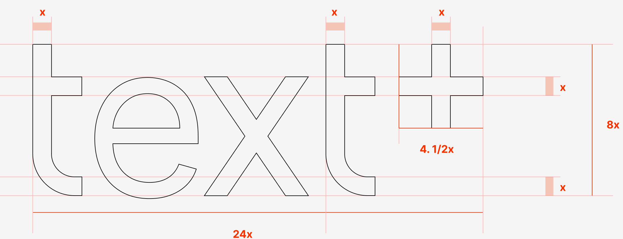
| Measure | Value |
|---|---|
| Unit (X) | the stroke thickness of the + |
| Logo width | 24 X |
| Logo height | 8 X |
The + symbol | a 4.5 X square |
Clearspace
Section titled “Clearspace”Keep a clear space around the logo equal to the cap height of the symbol. Nothing crosses that limit. Text, icons, edges, or another logo.
The dashed box marks the minimum clear space. The cap height of the + on every side.
Colour
Section titled “Colour”Three approved instances only. Green is primary; for print it’s Pantone 354 (U uncoated · C coated). Don’t recolour beyond these.



- Never type it: lowercase always, no uppercase (small caps only).
- No effects: no drop shadow, no glow, no textures.
- Don’t distort or rotate it, or place it on a busy / low-contrast background.
- Don’t use the wordmark’s font in other weights or typefaces.
- Don’t pair it with icons that could be mistaken for a logo.
Assets
Section titled “Assets”assets/brand/textplus-logo.svg (repo) · rendered here from /textplus-logo.svg. The three colour
instances (Deepblue · Green · White) live in the Style Guide.